By FPL_Staff
Many people know about the Caldecott. It’s like the Oscars for picture books, right? But what is the Caldecott committee looking for? What makes a picture book “good?” Here’s a look at how the award works and our very own FPL Mock Caldecott winner.
Firstly, who is eligible? Well, they have to meet 2 requirements:
- The book had to be published in English in the United States in the previous year.
- The illustrator must be a resident or citizen of the United States.
Something you might not realize is that the Caldecott is awarded to the illustrators and is based on the illustrations. Here are the criteria they use when looking at the pictures:
- Artistic technique
- Is the artist skilled? Unique? Masterful?
- Visual interpretation of the story, theme, or concept
- How well do the pictures themselves tell the story? Do they enrich the story or confuse it?
- Appropriateness of style of illustration to the story, theme, or concept
- Does the style of the illustration enhance the story and themes?
- The ability of the pictures to convey plot, theme, characters, setting, mood, or information
- Do the pictures make sense? Are they depicting something discernable and useful?
- Recognition of children as the audience
- Will children even get/like/understand this book?
You think that’s easy? Well, they’re not just looking at the pictures on the pages. They’re looking at the whole thing. What’s happening on the cover? The title page? Underneath the paper cover, on the cardboard? The endpapers? Nothing goes unnoticed.
Here at the Frisco Public Library, we held our very own mock Caldecott. I selected 10 books that have substantial buzz in the world of children’s books. Using the above criteria, we selected our three favorites:

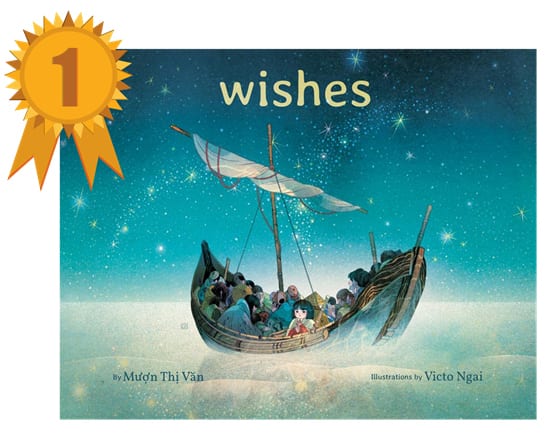
“Wishes,” illustrated by Victo Ngai, written by Mượn Thị Văn
“I picked Wishes because I thought the illustrations of the faces reflected the character's fear and hopes, and the colors used set the mood for each part of the story.” –Julie C.

“Mel Fell,” written and illustrated by Corey R. Tabor
“I picked Mel Fell because of how expressive the small, simple characters are along Mel’s journey. I also liked how keeping the illustrations framed from the same perspective with the tree along the edge gives a sense of the distance Mel travels. It’s like falling and flying with him.” –Kendall N.

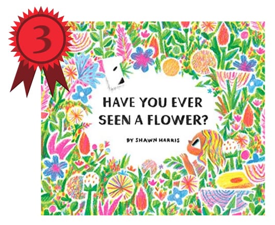
“Have You Ever Seen a Flower?” written and illustrated by Shawn Harris
“I chose Have You Ever Seen a Flower? because I found the use of negative space unique, and the illustrations portrayed a childlike wonder of the world.” –Lauren H.
We had a lot of fun with our mock Caldecott, and you can have one too with your kids or class! While there are no official nominees or shortlists, here’s a list of ten beautifully illustrated books from this year that people have been talking about:


Add a comment to: Our Mock Caldecott